KTX Coworking


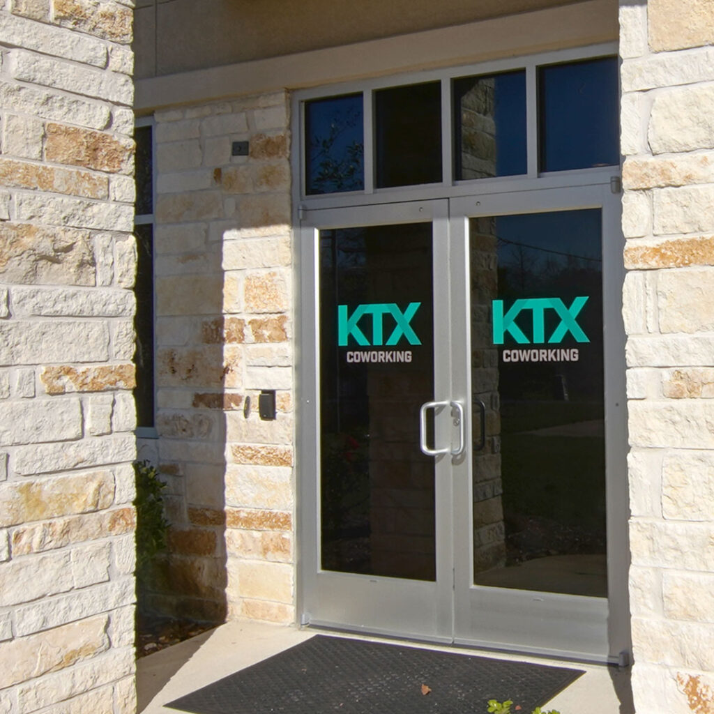
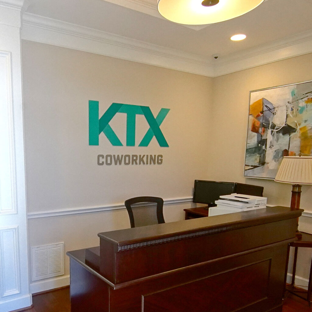
Our goal was to create a brand look and feel that was welcoming, comfortable and approachable for a variety of customers. We were able to achieve this by choosing a color palette that helped the consumer connect to their own aspirations and goals. We chose a friendly green as it represents life and energy and is associated with growth and harmony. The green is accented with a deep blue, which represents trust and loyalty and is also a very beloved color, accessible to many people. These colors make people feel comfortable and connected to the KTX Coworking brand and its easy for them to picture themselves being a part of the KTX Coworking family.
